Note
Access to this page requires authorization. You can try signing in or changing directories.
Access to this page requires authorization. You can try changing directories.
APPLIES TO: ![]() Power BI Desktop
Power BI Desktop ![]() Power BI service
Power BI service
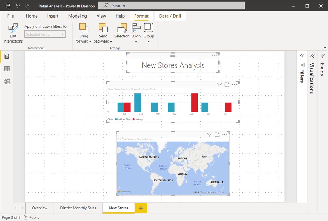
The report canvas in Power BI Desktop and the Power BI service provides gridlines that you can use to neatly align visuals on a report page. Use snap-to-grid and smart guides so the visuals in your report look clean, aligned, and evenly spaced.

Enable gridlines, snap-to-grid, and smart guides
To enable gridlines and snap-to-grid, select the View menu, and then enable the checkboxes for Show gridlines and Snap objects to grid. You can select one or both options because they operate independently. In addition, turn on Show smart guides to provide relative guidelines when moving a visual or group of visuals.

Note
If you disable Show gridlines and Snap objects to grid, connecting to any data source reenables them.
Use gridlines
Gridlines are visible guides that help you align your visuals. When you're trying to determine whether two or more visuals are aligned horizontally or vertically, use the gridlines to check if their borders align.
Use Ctrl+Click to select more than one visual at a time. This action displays all selected visuals' borders and shows whether the visuals are properly aligned.

Use gridlines inside visuals
In Power BI, visuals include gridlines that you can use as visible guides for comparing data points and values. You can manage the gridlines within visuals by using the X axis or Y axis card, depending on the visual type. These cards are in the Format section of the Visualizations pane. You can manage the following elements of gridlines within a visual:
- Turn gridlines on or off
- Change the color of gridlines
- Adjust the stroke (width) of gridlines
- Select the line style of the gridlines in the visual, such as solid, dashed, or dotted
Modifying certain elements of gridlines can be especially useful in reports where dark backgrounds are used for visuals. The following images show the Gridlines section in the Y axis card.
Select a visual. Select the drop-down carat next to Y axis in the Format section of the Visualizations pane.

Scroll to the Gridlines setting and set it to On. Then change the settings as desired.

Use snap-to-grid
When you enable Snap objects to grid, all visuals on the Power BI canvas that you move or resize automatically align to the nearest grid axis. This feature makes it much easier to ensure two or more visuals align to the same horizontal or vertical location or size.
For example, this visual is between gridlines.

After moving this visual, it's aligned with the grid.

That's all there is to using gridlines and snap-to-grid to ensure the visuals in your reports are neatly aligned.
Use smart guides
Smart guides are visible guides that help you align your visuals relative to another visual. These lines appear when you move a selected visual or group of visuals. When a smart guide appears, you can stop moving the visual, and it aligns to a neighboring visual. Smart guides appear for the center, sides, top, and bottom of the selected visual, with respect to a nearby visual.

Use z-order
You can manage the front-to-back order of visuals in a report, often referred to as the z-order of elements. This feature lets you overlap visuals in any way you want, then adjust the front-to-back order of each one.
Set the z-order of your visuals by using the Selection pane. On the View menu, turn on the Selection pane.

To reorder the layers, either drag a name to the desired position or use the up and down arrows.
Align and distribute visuals
In Power BI Desktop, the Format ribbon lets you align or evenly distribute selected visuals on the canvas. This feature ensures your visuals appear on the page in the alignment that looks and works best.
The Align menu aligns a single selected visual to the edge (or center) of the report canvas. When you select two or more visuals, you align them together using the existing boundaries of the visuals.

For example, if you select three visuals and choose the Align center option, the visuals then align to the center of all selected visuals.

You can also distribute your visuals evenly across the report canvas, either vertically or horizontally. Select more than one visual, and then select Distribute horizontally or Distribute vertically from the Align menu of the Format ribbon.

For example, if you select three visuals and choose the Distribute vertically option, the visuals then distribute evenly on the report canvas.
With a few selections from these gridlines, alignment, and distribution tools, your reports look just how you want them.

