Note
Access to this page requires authorization. You can try signing in or changing directories.
Access to this page requires authorization. You can try changing directories.
Model-driven apps have updated styling including fonts, colors, borders, and shadows that align with the latest Microsoft Fluent design system. The updated look makes model-driven apps easier to use so that users can accomplish their goals quickly and efficiently. The Fluent design system provides consistency, quality, and Microsoft-wide platform coherence. It also provides a solid foundation for extensibility and allows support for dark mode in the future.
Important
With the 2026 Wave 1 release, all users must use the New Look. Makers can't switch a model-driven app back to the classic look. This requirement doesn't include the Header and navigation refresh (preview).
The New look toggle was removed for users with the 2025 Wave 1 release.
What's included in the modern, refreshed look
Here's what you can expect in the modern, refreshed experience:
- Updated styling in form, view, and dashboard pages, which includes the use of drop shadows and brighter background colors to create an elevated or floating appearance. The floating appearance helps to visually separate sections and focuses attention on primary content.
- New Fluent-based controls in forms, business process flows, and dialogs. Dialogs now resize height automatically based on the content.
- A new Power Apps grid in place of the read-only grid in view and standard, dashboard pages.
- A new mechanism for customizing the app header colors to match your personal or organizational branding. To learn more, see Use modern themes.
Command bar
The floating command bar aligns with the Microsoft 365 experience, with consistent spacing, rounded corners, and elevation. Notice how the command bar is in a separate section at the top of the page in the following example.

View pages
View pages use the new command bar and updated grid areas that take advantage of the elevation changes to help draw the user's attention.
The most significant change on view pages is the switch from the read-only grid to the Power Apps grid control, which features infinite scrolling for a modern, data browsing experience. This grid also appears in subgrids and associated grids in main forms and dashboards. The Power Apps grid control also supports inline editing by using the Enable filtering property. Makers can manually configure their editable grids to use the Power Apps grid control.
The following example shows a view page with the modern, refreshed look.

Form pages
Form pages use the new command bar with refreshed headers, tabs, sections, and business process flows. Quick views, card forms, headers, sitemaps, and timeline controls also feature updated styling.
The following example shows a form page with the modern, refreshed look.

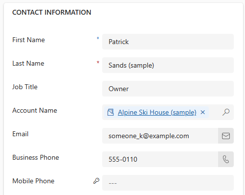
Field controls
Field controls such as text input, action input, lookup, and check box controls are built and designed by using Fluent components. Future updates will modernize more field controls by using Fluent design.
Field sections, which are containers for the fields on a form, have a more streamlined design. Icons are now on the right side of field labels. Some redundant icons were removed for a cleaner layout. Input and error message styling is also refreshed based on Fluent design.
The following example shows a set of fields with the modern, refreshed look.
Dashboard page
The system dashboard page, with independent subgrids and charts, uses the new command bar and has styling similar to the sections in form and view pages. When you turn on the modern experience, or when you use the monthly channel, the system dashboard grids use the new Power Apps grid control. The new grid isn't turned on by default.
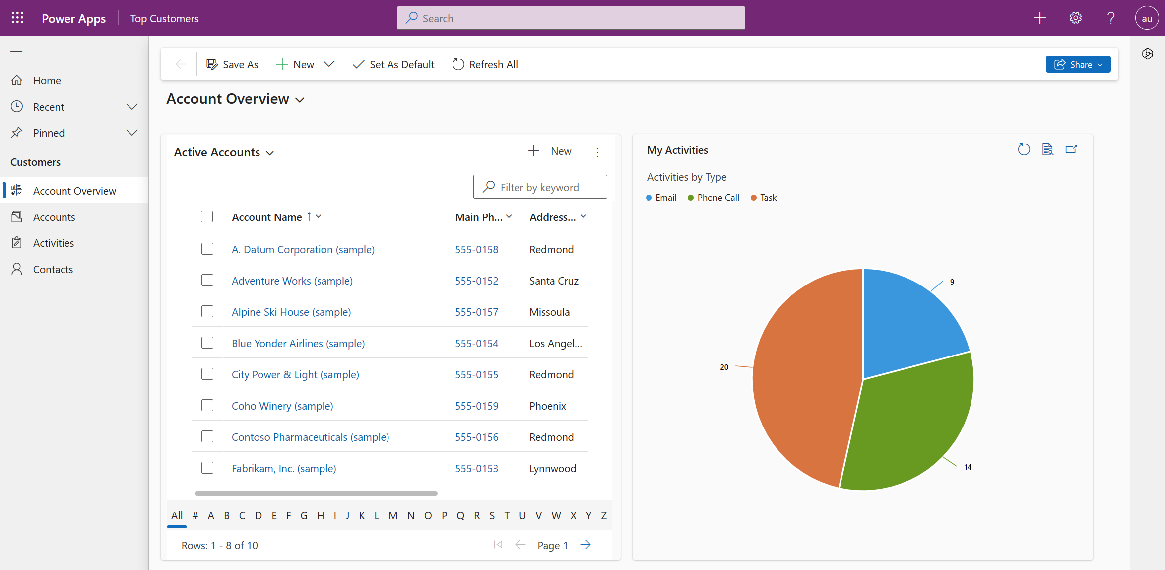
Chart controls
The chart controls on view pages and dashboards are updated to a new color palette for the modern, refreshed look.
If you customize the chart colors, the new look overrides your custom colors. To keep your custom colors, add the CustomColorOverride property in the chart .xml file.
<Chart CustomColorOverride="true">
Header and navigation refresh (preview)
[This topic is pre-release documentation and is subject to change.]
Important
- This is a preview feature.
- Preview features aren’t meant for production use and may have restricted functionality. These features are available before an official release so that customers can get early access and provide feedback.
The refreshed header and navigation make apps easier to use with a modern app header, streamlined sitemap, and condensed page headers with compact commands. This experience enhances productivity by reducing time spent navigating pages, finding commands, and learning layouts.
Here's how the new app header and the streamlined sitemap look:

Here's how the new form header looks with more focus on row details:

This update automatically applies to all apps generated by the Plan designer. For other existing apps, you can opt in by following these steps:
- In the app designer, select Settings on the command bar.
- Select Features, and then enable Header and navigation refresh.

Learn more in FAQ for header and navigation refresh (preview).
Known limitations
The modern, refreshed look for model-driven apps has some limitations:
Modern, refreshed look outside of browser
The mobile app and mail app don't support the modern, refreshed look. They aren't part of the preview or general availability.
Switching themes or enabling dark mode
Switching themes or enabling dark mode isn't supported at this time.
Honoring classic theming
With the modern, refreshed look, Power Apps is no longer honoring classic theme customizations. You can, however, override the colors for the app header to match your organization branding with the modern, refreshed look. Learn more in Change the color of the app header. Other theme customization options for the modern, refreshed look aren't available yet.
Custom icons
Only SVG icons are supported. If you use other formats such as PNG, the navigation doesn't display them and a default icon appears instead.
Frequently asked questions (FAQs)
1. Can I use the modern, refreshed look in the Power Apps component framework or in custom code components?
The modern theme in use is passed to Power Apps component framework components, so you can style your components with modern theming.
2. Can I use the modern, refreshed look in custom pages?
You can use modern controls with custom pages and the modern, refreshed look. Currently, custom pages don't use the modern theme.
3. Can I change the color of the app header?
You can change the color of the app header to match your organization while using the modern, refreshed look. To learn more, see Use modern themes. Other theme customization options for the modern, refreshed look aren't available yet.
4. FAQ for header and navigation refresh (preview)
Can I turn on Header and navigation refresh without turning on the New look?
No, you need to turn on New look in addition to turning on Header and navigation refresh to see the refreshed header and navigation experience in the app.
How do I enable the Header and navigation refresh for existing apps?
The feature is available as an opt-in capability for existing apps. You can enable it through the app setting.
Why don't I see the Help icon in the global command bar in the app header?
Help link to documentation is available in the Settings pane.
Where is the side pane rail next to the Copilot chat pane?
The side pane switcher becomes available only when there are two or more side panes in the app. When Copilot chat is the only side pane, the switcher is hidden.
Why does the sitemap of an app generated by the Plan designer look different from existing apps' sitemap?
Apps generated by the Plan designer will have a streamlined sitemap. Home, Recent, Pinned and sitemap groups are turned off by default for a simplified flat list of navigation options in the sitemap.
Revert to the classic look
Note
With the 2026 Wave 1 release, the New Look is mandatory for all users. Makers will no longer be able to switch a model-driven app to the classic look.
While end users have not been able to switch themselves back to the classic look since the 2025 Wave 1 release, admins can still turn off the new look for all users by updating the New look for model driven apps app setting.
- Open https://make.powerapps.com/.
- Under Solutions, open an existing solution with one or more model-driven apps.
- Select Add Existing > More > Setting.
- Search for New look.
- Select New look for model driven apps.
- Select Add to add it to the solution.
- Select New look for model driven apps from the solution explorer.
- Update Setting Environment Value to No.
- Add the apps to the solution for which you want to turn off new look.
- Update the value of the apps to No.
- Select Save.
- Publish all customizations.
To learn more about this and other app settings, see Manage model-driven app settings in the app designer.